All the Feels
A mobile app and responsive website concept for teaching children about emotions
Overview
Like adults, young children experience complex feelings. They get frustrated, excited, nervous, sad, jealous, frightened, worried, angry, and embarrassed. But without the words to express these feelings, they sometimes communicate them in other ways - by acting them out in physical, inappropriate, or problematic ways. Parents and caregivers play an important role in coaching children to name and understand their feelings, and deal with them constructively.
Many parenting resources touch on the subject of emotional learning, but few cover it exclusively. All the Feels is a non-profit concept dedicated to supporting parents and caregivers in teaching their children emotional intelligence.
The Problem
Teaching children how to recognize and manage their "Big Feelings" can be a challenge for parents, especially in the moment when emotions are running high. Although advice and activities are available online, they're spread across a vast array of parenting websites and not always conveniently accessible.
The Goal
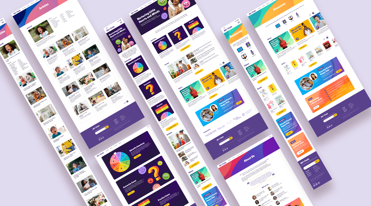
Design an interactive emotional learning app to be used by parents with their children, along with an accompanying website for additional guidance.
My Role
UX Designer (Research, Visual Design, Interaction Design, Usability Testing)
Responsibilities
Conducting research, digital wireframes, low and high-fidelity prototypes, conducting usability studies, iterating on designs.
Design Process
Research
Research involved one-on-one interviews with parents and caregivers to understand the challenges of teaching their young children how to manage difficult emotions. Secondary market research was also conducted to evaluate current resources for parents in the field of early childhood emotional development.
Target Audience
The target audience was parents of children ages 2-6. Individuals of various ages and socioeconomic backgrounds were selected to represent a diverse group.
Pain Points Discovered
Dispersed Resources: Parents struggle to find activities and advice by professionals all in one place
Inconvenience: Printed games and activities for teaching children about emotions are difficult to play spontaneously or on the go
User Personas
After learning more about parents' and caregivers' challenges, I developed personas to represent my distinct user groups. In this case, it was important to consider both the adults and children who the product would serve.
Competitive Audit
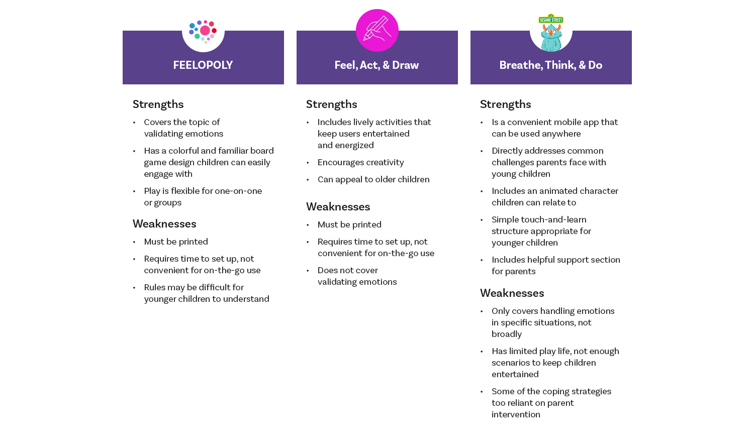
Market research provided further insights into how to solve users’ problems. After conducting an audit of 1 direct and 2 indirect competitors, several gaps in the market were identified:
Most activities and games for teaching children about emotions are printed-only, or require some physical materials
Sesame Street’s Breathe, Think, Do is a digital app parents can use on the go, but it only covers specific scenarios children experience. There’s a lack of digital activities that generally teach children about identifying and coping with feelings
User Journey
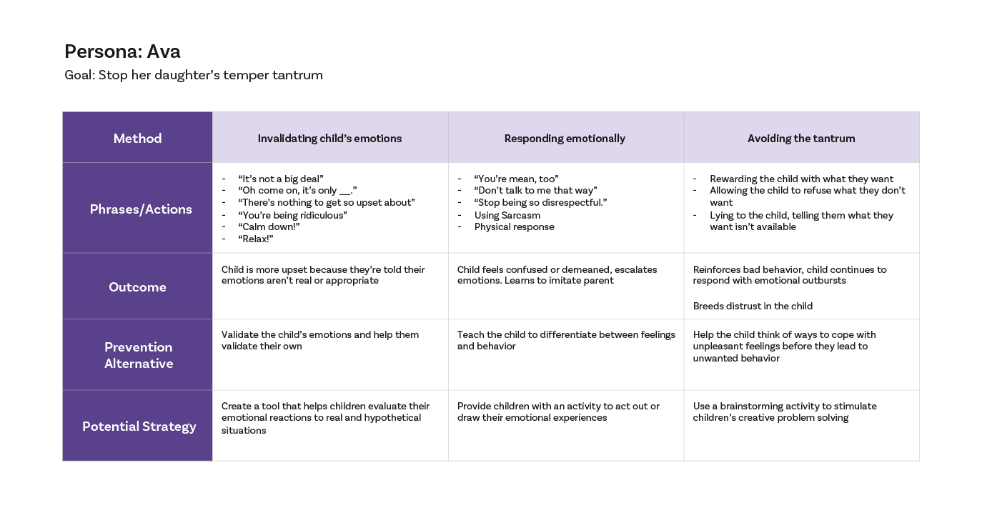
By creating a journey map of one of my personas, I uncovered key learning opportunities between the parent and child that the mobile app could address. In each example, Ava needed a tool to open up communication with her daughter to prevent the tantrum in the first place.
Information Architecture
Mobile App
After studying potential learning activities, I decided on 3 to translate to a digital app. Parents also expressed the need for quick tips and advice they could reference on the go, so a guidance section was included as well. These four elements were organized into the following sitemap, with the most recognizable emotions wheel game serving as a home screen:
Responsive Website
Based on the earlier-identified pain point that most advice on emotional learning is dispersed across many parenting sites, the goal of the accompanying web presence was to expand on the mobile app and serve as a comprehensive resource of information on the topic. The same 3 interactive games would be featured alongside a library of articles, videos and other media to educate parents:
Sketches
Mobile App
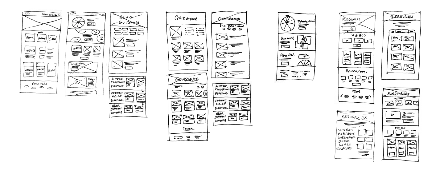
To begin the design phase, I started sketching screens of the app on paper. Referencing popular mobile app games gave me some helpful ideas on how to lay out the interactive activities. At this stage, it was also important to consider the interactions, as the activities needed to be engaging for children.
Responsive Website
The accompanying website ultimately needed to speak to parents and caregivers. To give it the appearance of a trusted resource, I experimented with common layouts used by news media sites.
Wireframes to Low-Fidelity Prototype
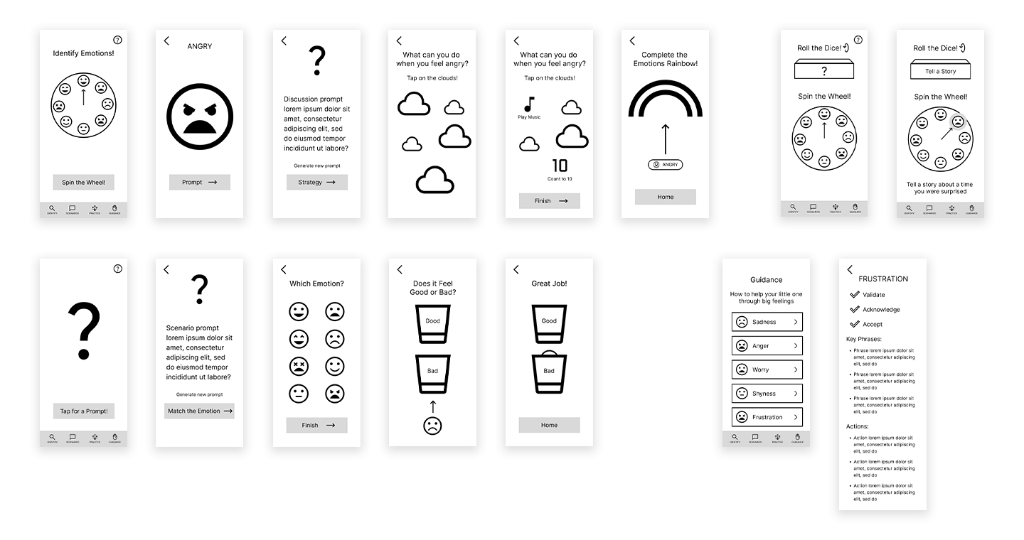
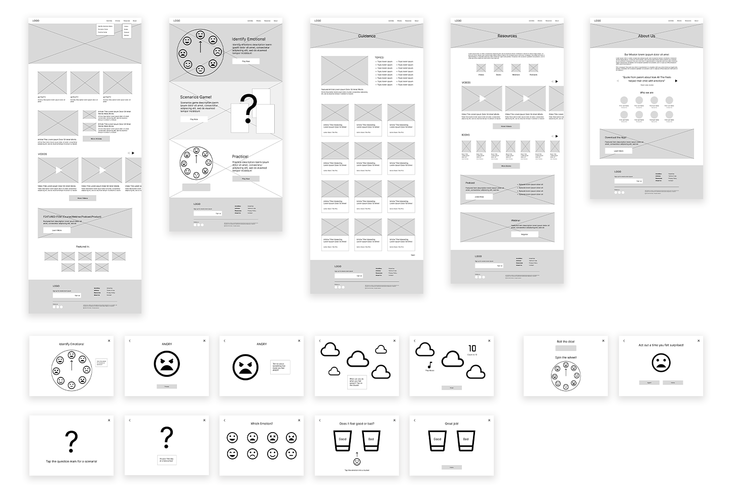
Once layouts for both the mobile app and website were decided, I began building them out digitally and adding more details. I then connected the screens into the main user tasks:
Mobile App
Following prompts through the 3 interactive games
Referencing the guidance section
Responsive Website
Following prompts through the 3 interactive games
Browsing articles, videos and other media
Usability Study
Before moving on to visual design, the next step was to test my low-fidelity prototypes in usability studies.
Mobile App
For the mobile app, participants were tasked with following through each activity alongside their child. They then answered questions about how easy or difficult it was to complete each activity and if their child engaged with the prompts.
Feedback from the usability study provided this insight:
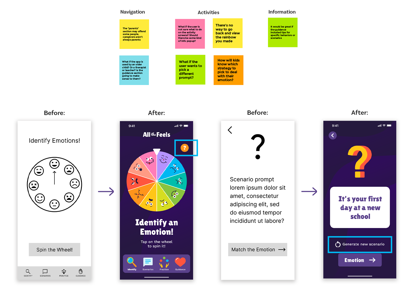
Some users weren't entirely sure how to complete each activity, or what the goal was. An info section needed to be added to each game for reference
Responsive Website
For the website usability study, participants were asked to navigate through the various resources offered to find what they were looking for. They also tested the experience of the interactive games on a desktop format. Overall, participants provided mostly positive feedback. The main change needed was redirecting the interactive games back to the activities page when closing.
Below is an affinity diagram of feedback received and some of the design changes made to the mobile app: adding a help button and a “generate new” option for prompts.
Visual Design
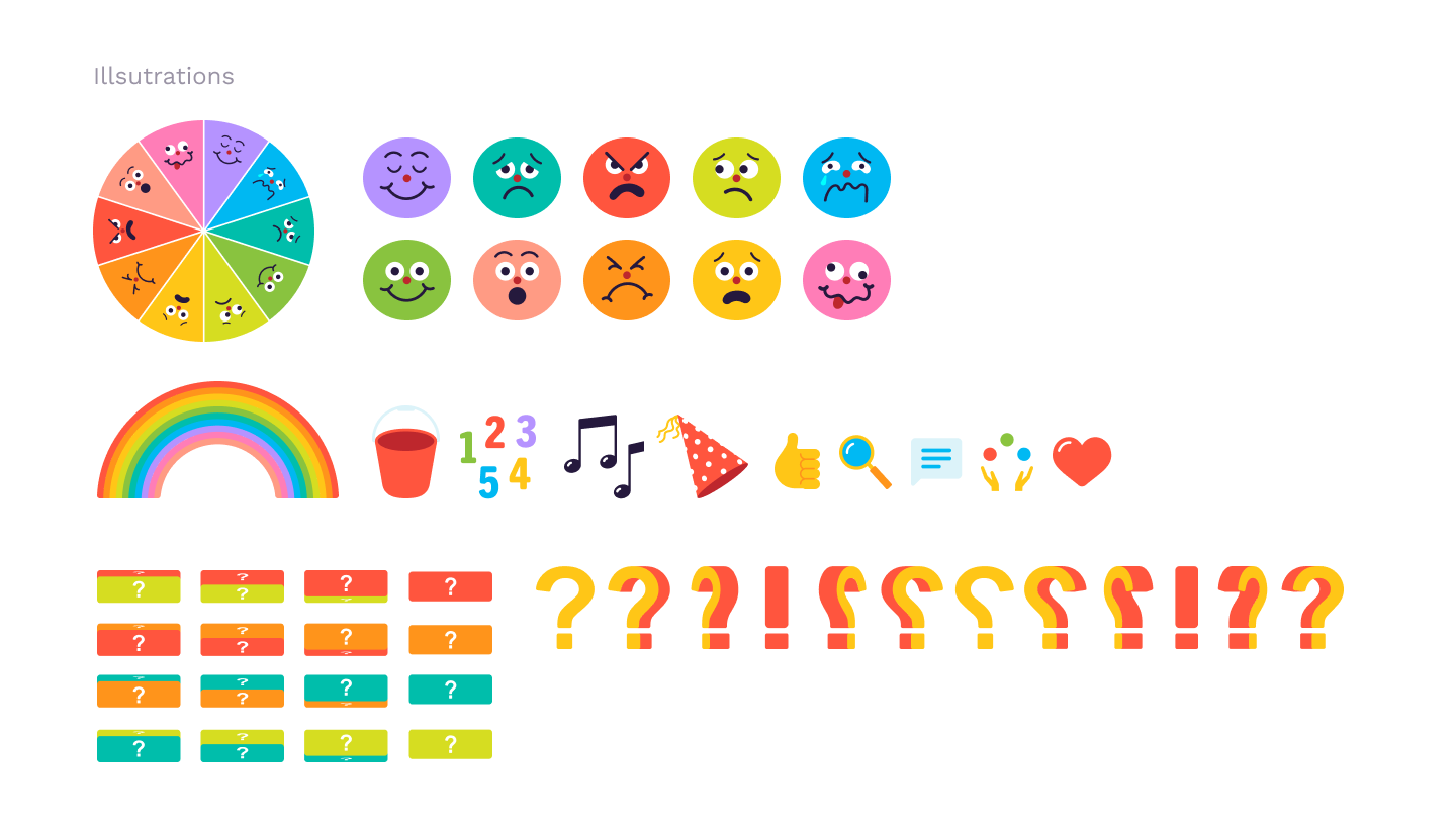
All the Feels needed to visually speak to both parents and children as a fun and friendly space to learn about feelings. Across both platforms, the playful typographic logo appears alongside bold but simple illustrations and a rainbow of colors. In the activities specifically, bright, saturated colors were used to attract children’s attention and help them distinguish between each facial expression.
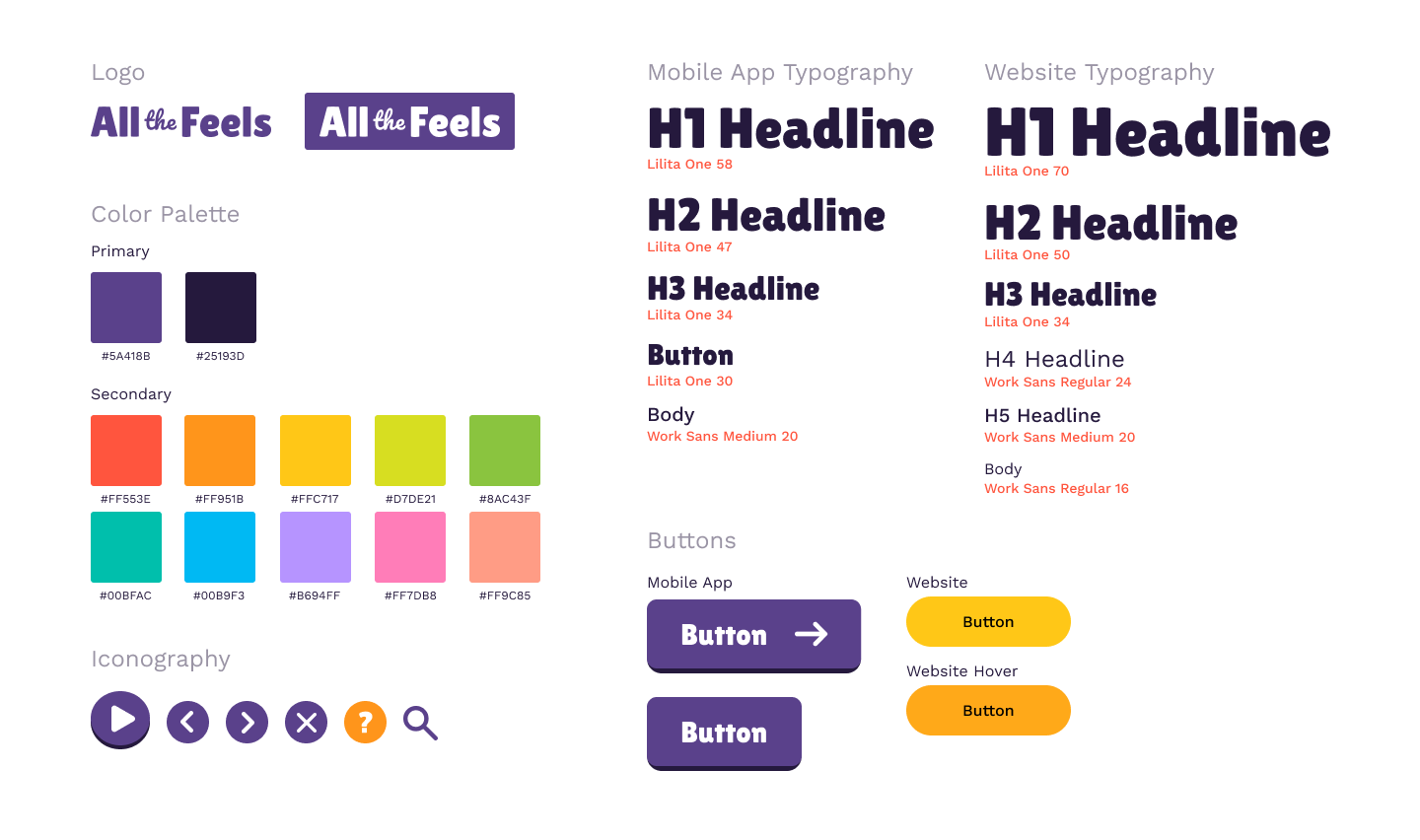
Once the app and website’s styles were established, a design system of UI elements and components was developed for each platform. The consistent set of buttons, icons and menus ensured a unified experience for users.
High-Fidelity Prototype
Final Thoughts
In my research on teaching children emotional intelligence, I learned that the most widely used tools and techniques are ultimately facilitators for discussion. The question was how to make these conversations with kids more engaging and memorable in a digital format. I think incorporating play helps accomplish this.
Next Steps
These are some items I would consider to build on the All the Feels concept:
Conduct research into how effective the activities are in improving children’s behavior
Test new interactive elements within the activities, such as a drawing feature, sounds, animations


