Sweetie’s
A mobile app concept for a hometown bakery
Overview
Sweetie’s is a charming neighborhood bakery with a long history of traditional recipes. The bakery’s authentic charm and dedication to quality make it a beloved business in the community. However, like many local businesses, it sometimes struggles to meet customer demands without the digital tools used by larger retailers.
The Problem
Sweetie's Bakery needs a product to improve the ordering experience of it's customers
The Goal
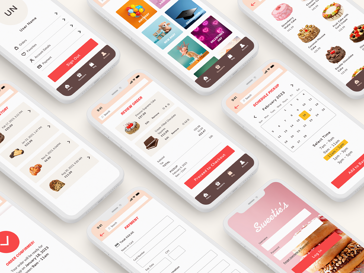
Design a mobile ordering app that allows users to browse the bakery and order items for pickup on their schedule.
My Role
UX Designer (Research, Visual Design, Interaction Design, Usability Testing)
Responsibilities
Conducting research, digital wireframes, low and high-fidelity prototypes, conducting usability studies, iterating on designs.
Design Process
Research
Research involved one-on-one interviews with potential users to understand their feelings and motivations for shopping at the local bakery, as well as challenges in the ordering and pickup process. Secondary market research was also conducted to evaluate competition in the bakery ordering space.
Target Audience
The target audience was set to adults ages 25 and up who live in a suburban area. Users of various ages and socioeconomic backgrounds were selected to represent a diverse customer base.
Pain Points Discovered
Time: Working adults are too busy to spend time waiting in line
Availability: Items sometimes run out before customers arrive
Information: No easy way to check ingredients for allergy concerns
User Personas
After learning more about user's goals and needs, I developed personas to represent 2 distinct types of users: those who are shopping for themselves, and those who are shopping for an item to bring to an event or special occasion. Both revealed key functions of the app that would be most important.
Competitive Audit
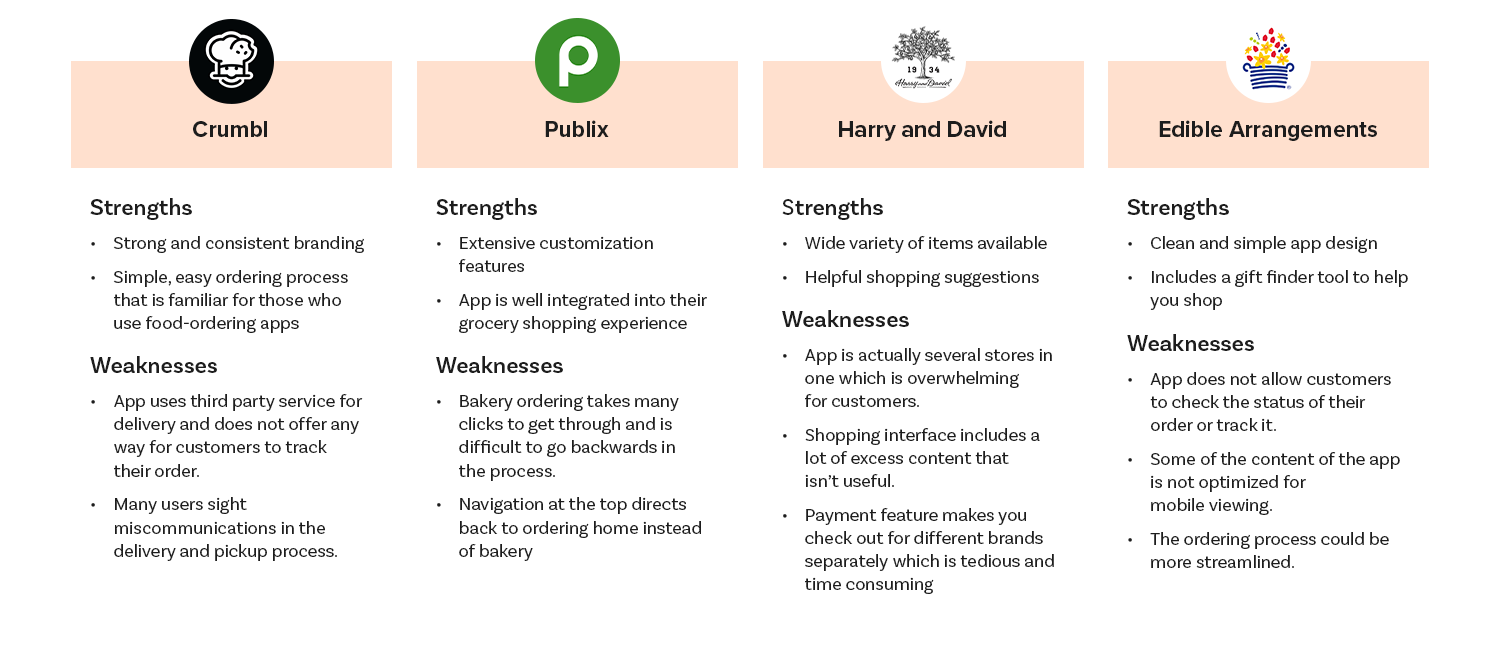
Market research provided further insights into how to solve similar user problems. After conducting an audit of 3 direct competitors and 1 indirect competitor, several gaps in the market were identified:
A small, local business shopping experience. Interviewees reported they value both the higher quality product and the friendly interactions at their local bakery. Opportunities to cater to these customer interests could include highlighting the bakery's recipe traditions and community connection within the app
Personalized settings, such as the customer's favorite items and saved dates for important celebrations
User Journey
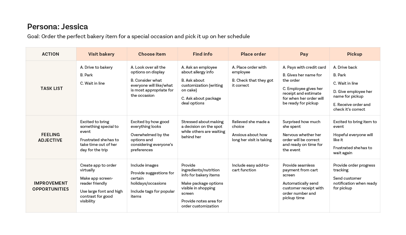
By creating a journey map of one of my personas, I uncovered key points of friction within the shopping experience that the mobile app needed to address. For example, user Jessica struggled to find product information prior to ordering.
Information Architecture
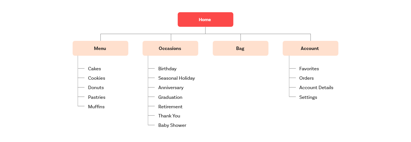
After deciding what features to include in the app, the next step was to organize the content into a sitemap. Key items to lay out were the bakery's menu offerings and the user's shopping details. This visual representation of the product's structure would provide a framework for the design.
Sketches
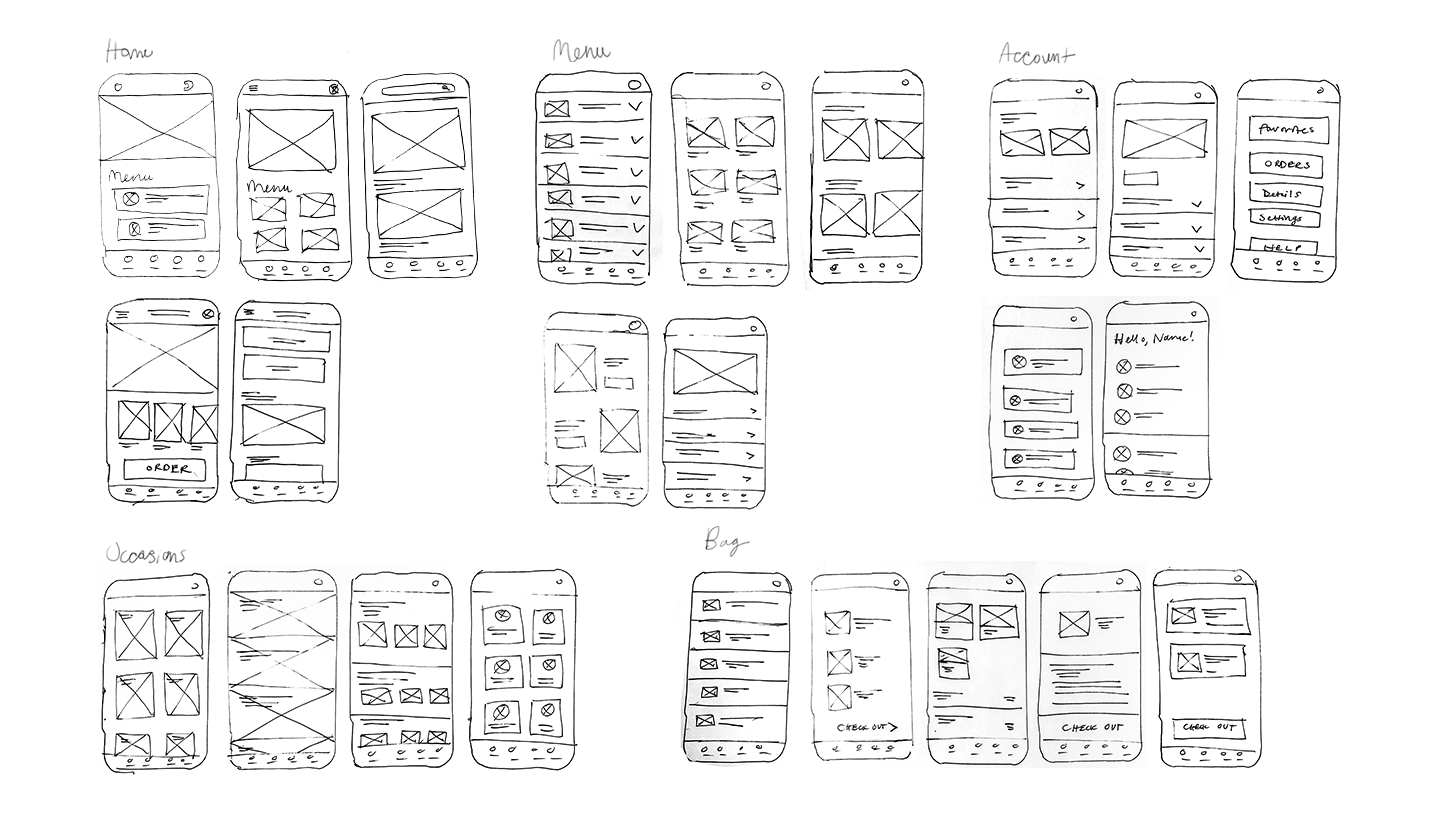
To begin the design phase, I sketched screens of the app on paper. Exploring common design patterns within the mobile food ordering space helped me identify which layouts would work best for completing core tasks.
Wireframes to Low-Fidelity Prototype
Once layouts for each screen were decided, I began building them out digitally and adding more details. I then connected the screens into the main user tasks:
Browsing the bakery's menu
Placing an order for pickup
Editing an order
Usability Study
Before moving on to visual design, the next step was to test my low-fidelity prototype in a usability study. Participants were asked to select an item of their choice off the bakery menu, place an order for pickup, and make edits to their order. Throughout the process, participants answered questions about how easy or difficult it was to complete tasks.
Feedback from the usability study provided several insights to improve the design:
Users didn't always want to schedule their order. Many wanted to pick up their item as soon as it was ready. The order scheduling feature needed to be made an option instead of a default requirement.
In the case of ordering cakes, users weren't always aware of the bakery's available options to customize. The product screens for cakes needed to show customization options
Users struggled to edit the details of their order. Options to edit an order needed to be made more obvious and clickable
Below is an affinity diagram of user feedback and one of the resulting changes that was implemented - making order scheduling optional:
Visual Design
Playing into the bakery's nostalgic, homestyle baking theme, Sweetie's logo and branding were inspired by antique American shop signage. I wanted the visual elements to communicate the feeling of a charming, quaint bakery that serves up delicious treats and warm hospitality. This aesthetic would set Sweetie's apart from the competition.
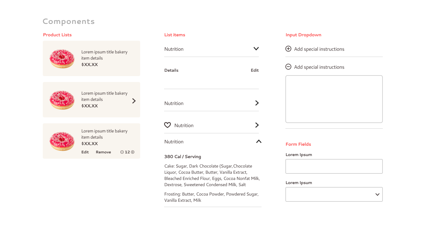
Once the app's styles were established, a flexible design system of UI elements and components was developed. The consistent set of buttons, icons and menus ensured a unified experience for users.
High-Fidelity Prototype
Final Thoughts
In the process of designing Sweetie's Bakery app, I learned that utilizing common UX patterns is an effective way to make a product easy to navigate. Thanks to popular apps such as Starbucks and Uber Eats, users have certain expectations of how to complete common tasks in mobile ordering. The challenge is to provide a familiar experience while also delighting and surprising the user with features they didn't know they needed.
Next Steps
These are some items I would consider to develop the app even further:
Explore ways to promote the bakery's sales and special offers
Conduct more research into how to optimize the menu by prioritizing popular items
Test and possibly modify the app's functionality for more complex multi-item orders such as dozens of cookies or donuts


